

Scratching the surface is often not enough. Good landing page design calls for neat information architecture and pleasant visuals yet that’s just the tip of the iceberg. In order to create something that brings results, you need to dig deeper and learn about your users.
Of course, no two target audiences are alike. Luckily, there are some psychological principles that can be used as a general rule. In this article, we’ll go through some of the most helpful rules for web designers. To better understand how to apply them in your day-to-day work, we’ll also look at some real-life examples. Let’s dive in!
Jakob’s Law
This principle raises the question: Why reinvent the wheel? There are plenty of proven and tested design solutions you can stick to. The best is often the enemy of the good. You might come up with a perfectly polished solution and realize that your users still prefer the old version. When you try to be overly innovative, you might end up misunderstood.
The name Jakob’s Law comes from Jakob Nielsen of the Nielsen Norman Group, an acclaimed UX research institute. The law itself is simple. It states that people spend most of their time on other websites and are therefore already used to certain design patterns. When you stick to these design patterns in your landing page, the experience will be more familiar and intuitive.
It’s easy to see when you look at several examples:
These examples come from marketing leaders- and they have a lot in common:
The Navigation
On the desktop versions, the company’s logo is on the top left, followed by the navigation bar. The top right-hand corner is the place for login and signup buttons, sometimes accompanied by the search bar – in other words, a tool to find out more about the product. What’s more, all mobile versions feature a hamburger manu. These three (or even two) horizontal lines are widely understood by the vast majority of users. Again, there’s no need to reinvent the wheel.
The Layout of Textual Content and Images
The layouts of these landing pages echo the left-to-right reading direction of Latin languages. This makes for a more intuitive structure. The text is in the first column and is also aligned to the left. The hero image or video is always on the right (or below the text on mobile devices).
The Mental Models
Jakob’s Law leverages the user’s existing mental models. In layman’s terms, this means the user already has a representation of the experience in their mind. They expect certain functions to be found in certain places and to work in a specific way.
When it comes to landing pages, people tend to scan them according to the Z-pattern (see image below):
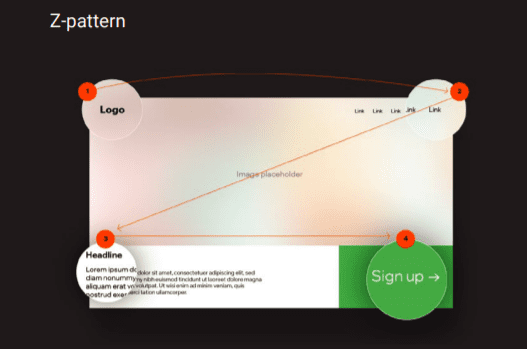
The pages we’ve used as examples follow this design quite closely. The logo and the login button remain in the same place, yet the strategy has slightly changed for the main CTA. Instead of placing the CTA at the fourth focal point, the designers have stuck to the minimal amount of information and placed the signup button at the third point of the Z-Pattern.
Principle Of Least Effort
We don’t process more information than is necessary, but it’s not because we’re lazy. We just have a lot on our plates. Did you know that we process around 100,000 words every day? It’s the equivalent of a medium length novel, such as The Hobbit, or Harry Potter or the Prisoner of Azkaban.
Keep in mind that every landing page contributes to information overload. Here’s how you can use the principle of least effort in your web design efforts:
Cut The Experience Short
Analyze the user journey and find the weakest spots. See where your visitor drop out. It might mean that this part of the experience causes friction and discourages the user from proceeding. The solution? You can redesign the journey, make it shorter, and remove potential points of frustration.
Stick To Plain Language
It’s not all about visual design – it’s also about written content. When your audience has to go through industry Jorgen and complex paragraphs, it adds extra tasks to their cognitive load. Use short sentences and simple vocabulary to create a better experience for your users. This is particularly important on landing pages, where the space for text is limited and you need to strike all the right chords with the right words.
You might also be interested in Blending Storytelling and Web Design
Hick’s Law
When it comes to options, is it more the merrier? It would probably work like that if our decisions were purely rational. Hick’s Law states: the more choices we have, the longer it takes to make the final decision. This became the foundation for the KISS acronym. No matter if you choose to interpret it as Keep It Short and Sweet or Keep it Simple, Stupid, the idea remains the same.
A similar phenomenon was described by Barry Schwartz in his book The Paradox of Choice. The author goes one step further and states that limiting choice can reduce the user’s anxiety. Choosing from a variety of options offers certain with the final decision, We blame it on ourselves.
The takeaway? When we take certain decision for our users, we might be doing them a big favor. Here’s how to design with Hick’s Law and the Paradox of Choice in mind:
- Focus on a single goal: Why just Why just one? Almost half of all landing pages have more than one offer, even though including more than one option may decrease conversion rates by as much as 266%. Instead of trying to squeeze in as much information as possible, create more landing pages that are designed for a single purpose.
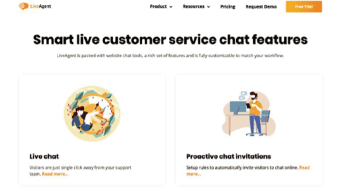
- Try progressive disclosure: Easier said than done, right? We know that some information can’t be entirely omitted. Luckily, there’s a workaround for that. Progressive disclosure sequences information across several screens. To keep your landing pages clean and simple, you can include the main categories or the essential details on the landing page, and then guide the users further for more information. If you need inspiration, here’s an idea from LiveAgent, a customer support platform:
Figure/Ground
In the context of landing pages, the law of figure/ground is particularly common. This phenomenon is typically illustrated with this popular picture:
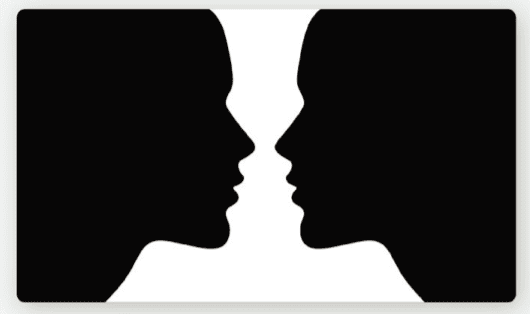
You can either see two face profiles or a vase. The same element can be perceived either as the figure or as the background. This is a classic example of a reversible relationship between the figure and the ground. Depending on the context, the same part of the picture can serve as both of them.
The law of figure/ground is one of the Gestalt Principles goldmine of information (and inspiration) for web designers. These laws were created by psychologists of the Gestalt group. They studied how people make sense of stimuli around them and how they perceive and interpret objects to make sense of the whole picture.
Kurt Koffka, one of the members of the group, came up with a brief manifesto. He stated that “the whole is other than the sum of the parts”. This sentence is beautifully universal and works great as a reference for web designers. It shows us that no matter how much time you spend working on a particular element, it won’t get you far if it’s not a strategic part of a bigger picture.
Each element you design is perceived differently when it’s part of a bigger set of elements. In landing page design, you will aim for a stable relationship between the figure and the background. The figure should stand out. This can be achieved through contrast and color. Have a look at this great example from HelpDesk:
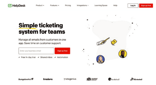
The aim of this landing page is crystal clear. They want the user to sign up for the service, and they make it easy for them. The main CTA is a bright orange button that is in direct contrast with the background, making it stand out with a distinctive hue.
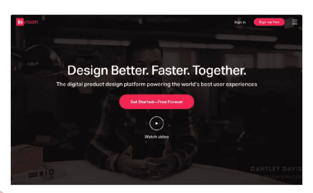
You can also play with the size of the elements. For instance, InVision made the “Get Started” button significantly bigger than other components on the website:
Pareto Principle
Every web design process needs priorities, especially when your resources are limited. The Pareto principle can help you define your design strategy. According to this approach, 20% of efforts cause 80% of the outcomes. With this in mind, you could state that 20% of your design accounts for 80% of the success. Let’s have a closer look at data. If you’re using heatmap software on your website, you’ve probably already noticed that only a small fraction of all users scroll all the way to the bottom.
Research from 2018 suggests that users spend 57% of their time on a website above the first fold. 74% of the time is dedicated to the first two folds. This is where you should focus the majority of your efforts. Of course, it doesn’t have to work exactly the same way for every landing page. We encourage you to test new solutions or to use session recording software and watch users interact with the website. Here are some ideas on how to use the Pareto principle in design:
Suggest options: You don’t always have to display the whole alphabetical list by default. Instead, you can make things easier for the user and move the most likely choices to the top.
Prioritize features: Analyze the most common requests and the most used features on your website. This will help you build landing pages that are more likely to meet the user’s needs. If you’re getting a lot of questions about a particular feature, or if a particular service generates most of your traffic, it’s a clear sign that it deserves more attention. Decide what goes first on mobile: Whimsical is a great example here. This collaboration tool was designed for desktop users. Here’s what their desktop landing page looks like:
Social Proof
Now that we’ve discussed a range of principles coming from cognitive science, it’s time to turn to social psychology. You might have heard of Influence: The Psychology of Persuasion, a classic book by Dr. Robert Cialdini . Although this title is several decades old, it’s still a great source of knowledge about the core mechanisms of persuasion.
One of the most widely known phenomena described by Cialdini is social proof. It describes how people tend to think that actions taken by others are worth following. In other words, we’re more likely to do something when we see other people doing it. What’s more, social proof works better when we see other people as competent. This principle is commonly used on landing pages, even by industry giants such as Ahrefs:
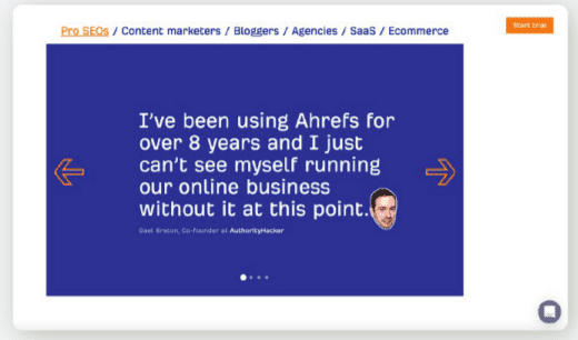
The main page is studded with raving reviews from SEO industry influencers, such as Brian Dean of Backlinko. They’re also using a popular trick of adding logos of companies who use Ahrefs.
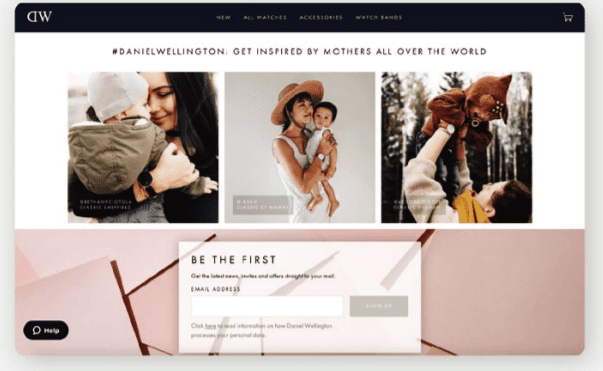
Another interesting way to use social proof is through user-generated content. Daniel Wellington, a watchmaker brand, is one of the leaders in this category. They use pictures of real
people wearing their products on their website. This builds trust and makes their customers feel like part of a community: